Like ’em or hate ’em, bullet points are a big part of e-learning. And when used appropriately, they’re an effective way to chunk content.
Unfortunately, that’s not always the case. Years of misused bullet points have altered learners’ DNA in such a way they skip right past them.
So what’s an e-learning designer to do? One way is by viewing bullets as design elements.
We know visuals are noticed before text. So let’s use this to our advantage by designing bullets as the focal point to hook learners back into the content. After all, it’s the content that matters, right?
Here are three ways you can begin creating more visually engaging bullet points in your e-learning courses.
1. Use Your Client’s Logo in the Bullet Points
It doesn’t matter if your client is Fortune 500 or a two-person consulting firm, everyone likes seeing their courses branded.
Bullet points are an easy way to customize a course. Just swap out the default bullet points with your client’s logo or other branding elements.
Keep in mind many logos don’t scale well at bullet-sized dimensions. In those cases, it’s a good idea to extract the essential design elements from the logo to create a derivative.
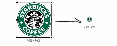
For example, let’s look at the Starbucks logo. Try scaling the logo down to 22×22 pixels. It doesn’t look so hot and we’re probably doing more harm than good at this point.

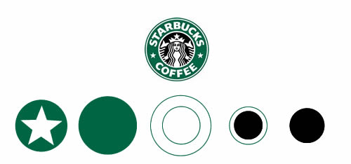
By examining the logo and isolating design elements we can create new designs that still align with the branding.

And now we have one possibility for incorporating branding into our bullets:

But what about companies with specific policies against using their logos in such ways? No problem! Look to the content to influence the design elements.
Consider a driver safety course. A chapter might be on road distractions with a sub-topic on bicycle distractions.
Yellow caution sign + bicycle illustration = custom bullet opportunity!

So, a pretty simple design tip that usually goes over big with clients.
2. Create Custom Objective Screens
One thing I see a lot of new designers do is treat all content screens the same. They’ll use the same slide template for chapter intros, objectives, activities, scenarios and so on.
If you wanted to make a single design enhancement to your courses, take a look at creating custom objectives screens.
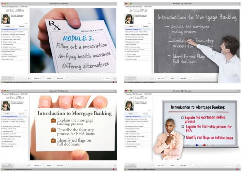
Celebrate your bullets by placing them on a content-inspired slide using a different typeface from the other slides. Handwriting fonts are a great choice for objectives. Why? Objectives are the openers, the icebreakers. They should be friendly, approachable and most of all creative.
Here are a few examples of ways you can mix up your presentation style for course and module objectives.
Extra credit: Create your text using uneven paths for even greater authenticity.
3. Animate Bullets with Style!
Flash-based bullets are another way to add more cowbell to your bullets. They’re fun to create and I’ve seen design teams compete for the most creative animated bullets.

Here are a couple examples. Feel free to download the Flash CS3 files to use as you like.
Final Thoughts on Syncing Bullets with Audio Narration
I know there are some active conversations around animation and learning. I follow those conversations and agree e-learning designers should understand the research. But I also feel designers should break the rules once in a while and try new approaches.

You can also allow the learner to click bullets in order to reveal the particular bullet points. Not on every bulleted screen, mind you. But having them do it on a few screens keeps them engaged, even if it is in the simplest of ways.
Learn To eLearn
John that’s a great example and I totally skipped over it. Thanks for contributing!
Here’s a little constructive criticism.
On point 3, animating bullet points sounds like a good idea, but it doesn’t actually engage users. In fact, it may even annoy people if it’s done over and over again.
Your time would be better spent turning the bullet points into illustrations or photos, and then list your text under each photo. Try to enhance the learning instead of distract from it.
I know I hate reading bullet points. Try to replace or supplement them with images, interactions, tasks, etc. I think this will make it more interesting for the learner instead of trendy wiz-bang effects.
I hope this post isn’t indicative of the rest of the posts. I would have to say most of this goes against what we know about adult learning from theory and research AND is impractical. Perhaps this was written by a graphic artist, but a well-informed instructional designer would not choose any of these examples. Sorry, but they don’t contribute to the learning and may in fact drain attention and working memory.
I could see using the first and second examples for some of our sales and product training courses.
I probably wouldn’t animate them like you describe in the last example but it’s great to see examples.
Denise
Hi Corey – Thanks for your feedback. These are just some examples I’ve seen or worked on in the past so they’re conversation pieces:-)
Good point about design choices and where designers put there time. I think bullets have their place and can surely be effective devices for arranging content, especially for read only e-learning.
What would you say to new designers working with a learning model that requires learning objectives for each module? Can you share some creative ways you’ve approached objectives?
@Mind the gap
I’m not a fan of animated bullet points – but using images other than traditional bullet points can enhance memory retention if used sparingly and appropriately.
Green tick / red cross bullet points are a classic example of how Western learners are more likely to retain information.
And using bullet points to enhance branding, won’t distract from memory either. It used appropriately, it just makes your desing look more slick.
I think it’s always important to remember that these posts are about encouraging us to ‘think outside the box’.
Thanks for offering download of the Flash CS3 files. Can you please clarify how to do this when there is not a download link? (When I right click and save, I get the html file for the page.) I would love to play with these.
@Jenniferq – Not sure why the link wasn’t visible. I updated the page and the link should be available below the preview examples. https://ihube9.p3cdn2.secureserver.net/files/Flash-bullets.zip
I like these ideas and like many of the others who have commented, understand that the idea here is to make things more visually appealing if you have a couple slides where the client is requiring bullets. Yes, if you overdo it by having bullets on every slide, adding animations, logos, or other creative effects won’t save you from that poor ID decision.
Thanks, Dan! I really enjoyed your recent posts on bullet point makeover ideas: https://dansweigert.wordpress.com/2015/08/29/making-bullets-more-imaginative/ Look for an upcoming challenge based on ideas shared in your post!
Thanks for these really handy tips! Tip 1, especially, will be the client’s favorite considering the brand value it’ll render to the course. Custom objective screens make a lot of sense too and can be customized based on the industry one is focusing on. An approach I’ve frequently used is to choose an appropriate image to represent each bullet point. Another hack is to select your bullets and convert them to SmartArt (only applicable in PowerPoint). 🙂