
As e-learning designers, you've likely been asked to create slides where learners need to click all buttons or interact with everything before continuing to the next slide or module. This happens … Read More...
FEATURED POSTS
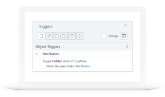
Toggle Hidden & Disabled States in Storyline 360
A recent update makes showing and hiding objects in Articulate Storyline 360 easier than ever. Using the new toggle … Read More...
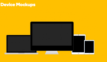
PowerPoint Tutorial: How to Design Apple Mockups and Wireframes
Learn how to create your own illustrated mockup and wireframe devices using PowerPoint's basic shape tools. In this … Read More...
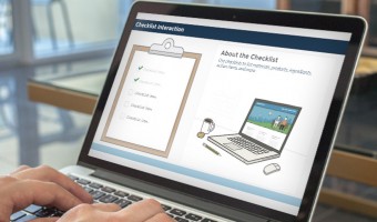
Free: E-Learning Checklist Interaction for Articulate Storyline
Checklist interactions are creative activities for listing out notes, products, steps, review items, and more. I recently … Read More...

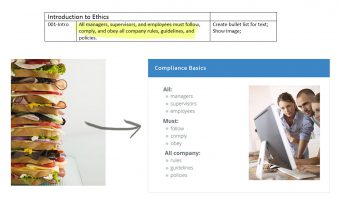
E-Learning Course Templates for SMEs: Compliance Edition
Tired of sinking time into convincing clients and SMEs that there’s more to e-learning than click-and-read compliance … Read More...
E-Learning Mistakes: The Dagwood
Here’s a common writing/development mistake found in many e-learning courses. It’s nicknamed it the “Dagwood” because the … Read More...

Design Better $#@*! Scenarios with Unnecessary Censorship
A lot of course designers today are really trying to move past click-and-read courses. They realize the value of non-linear … Read More...

Magical Ideas for Designing Engaging, Text-Based Courses
Ever tried to create an engaging text-based online course? It’s harder than it sounds. See, many text-based courses are … Read More...
PSA: Dangers of Vertical Video Syndrome
Vertical videos are bad. The good news is that you can take steps to prevent vertical video syndrome. Learn about the … Read More...
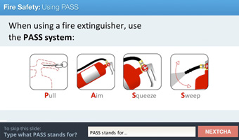
Dump the Next Button: Increase Learner Engagement with NEXTCHA
Ask Learners to Prove They're Learning! If you’re like most e-learning designers, you’re always keen to explore new ways to … Read More...
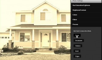
Enthread – Online Image Editor
Simple and efficient image editor with some nice filter effects. Here's a quick screencast highlighting some of Enthread's … Read More...